 MIKE HIGGINBOTTOM
A Digital Garden - frequent growth but a bit weedy in the back corner
MIKE HIGGINBOTTOMA Digital Garden - frequent growth but a bit weedy in the back corner
Just a gentle self reminder that you can’t, and definitely shouldn’t try to, fix everything.
I’ve been playing with ARP recently and I needed to draw some scatter plots of several thousand points. No spoilers as to why - you’ll just have to wait and see. I’ve not needed to do anything like this for a long time so I decided I’d have a quick dig around and see what tools to use. Plotly and Matplotlib seemed to be the two main contenders with Plotly being the young blood, more dynamic, easier to learn but not quite as powerful as the old dog Matplotlib. Still not entirely sure about the best choice but I went with Plotly.
I wanted vector based output so I opted to create my plots in SVG. That way they look nice even when zoomed in, I can edit them by hand or with code if I need to (although I can’t imagine ever really needing to do that) and SVG is a nice format for portability between use cases e.g. I can throw it up on a web page.
The test plots came out nicely but when zooming in on the real data plots it looked very much like the data points were bitmaps rather than SVG. So I wrote up a minimal Python script to do a bit of debugging. It just generates a load of random data points and plots them into and SVG image file.
#!/usr/bin/env python3

import random
import pandas as pd
import plotly.express as px

num_points = 4000

x = list(range(0,num_points))
y = [ random.random() for i in range(num_points) ]

data = {
  "x": x,
  "y": y
}

df = pd.DataFrame(data)

fig = px.scatter(df, x="x", y="y")
fig.write_image(file="plotly_scatter.svg")
Here’s a side-by-side comparison of what I was expecting (vector data point markers) against what I was getting (bitmapped data point markers).
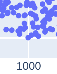
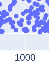
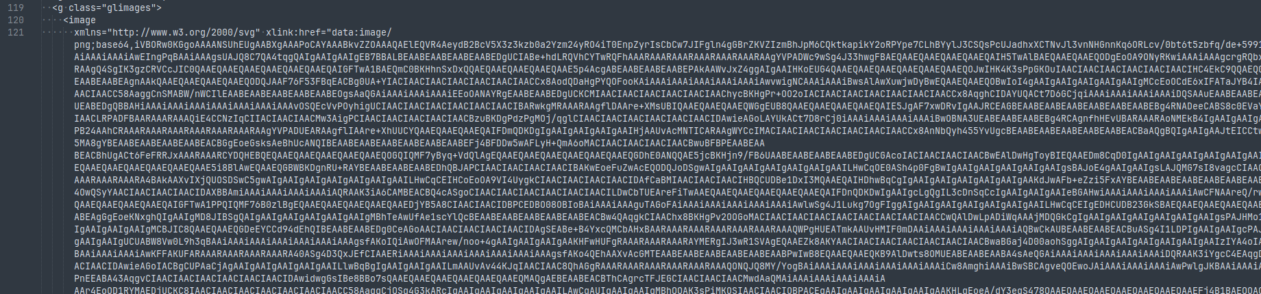
A quick look at the SVG file in a text editor confirmed this - there was a giant blob of base64 encoded data representing the data points image layer.
I had a quick Google but couldn’t find much so I just switched over to using Matplotlib. But it was kind of bothering me so I dug into it a bit more and went through the issues on GitHub. Didn’t take me very long to find Fake SVG Scatter Plots
TL;DR: Even though the docs state that “The file format is inferred from the extension”, what actually happens is that an optimisation comes into play when there are more than 1000 points such that you don’t get the data point markers in SVG.
What you actually need to do is explicitly specify the render mode using
rather than